
Polymorphic components are a powerful concept within React that enables adaptability and flexibility. In this blog post, we'll explore polymorphic components and demonstrate their usage with TypeScript.
Understanding Polymorphic Components
Polymorphism refers to the ability of an object to take on different forms or behaviors based on the context. Think of it as Ditto from Pokemon.

In the context of React:
- Polymorphic components in React allow for the creation of versatile UI elements that can adapt their rendering and behavior based on the context.
- By leveraging polymorphic components, developers can build reusable and adaptable components that suit different use cases.
- TypeScript's type system enhances the correctness and maintainability of polymorphic components, providing strong typing and error detection.
If you are in a scenario of building a components library, having a few components that adapts polymorphism helps
- reduce repetitive components for some use cases.
- by creating multiple variants of a single component.
- because it’s just cool.
Implementing Polymorphism into Button
1. Type
Let's create a simple example of a polymorphic button component using TypeScript. We'll start by defining the props interface that our button component can accept:
interface ButtonProps {
  onClick: () => void
  variant?: "primary" | "secondary"
  disabled?: boolean
  // Other button-related props
}
2. Component
Now, let's create our Button component. I’ve also enhanced the existing ButtonProps:
import React from "react"

type ButtonElement = HTMLButtonElement | HTMLAnchorElement
type ButtonProps<E extends ButtonElement> = {
  as?: keyof JSX.IntrinsicElements | React.ComponentType<E>
  variant?: "primary" | "secondary"
  disabled?: boolean
  // Other button-related props
}

const Button = <E extends ButtonElement>({
  as: Component = "button",
  variant = "primary",
  disabled = false,
  ...props
}: ButtonProps<E>) => {
  return (
    <Component disabled={disabled} className={`button ${variant}`} {...props} />
  )
}

export default Button
In this implementation, we introduce a type parameter E that extends ButtonElement to ensure that the as prop provided matches the appropriate HTML element types (HTMLButtonElement or HTMLAnchorElement).
3. Implementation
Now, let's see how we can use our polymorphic Button component:
import React from "react"
import Button from "./Button"

const App = () => {
  return (
    <div>
      <Button onClick={() => console.log("Button clicked")}>
        Default Button
      </Button>
      <Button as="a" href="<https://example.com>">
        Link Button
      </Button>
      <Button as={CustomComponent}>Custom Button</Button>
    </div>
  )
}
In this example, we demonstrate the versatility of the Button component. We can use it as a regular button, an anchor tag, or even provide a custom component to be rendered.
You might ask, what about implementing something a little more advanced? Like passing down ref or use a more sandbox element like div so I can instead inject Card, Section, etc? Well yes, that is all possible. Let’s visit that in the next section of this blog.
Implementing Polymorphism into Text
For this implementation, I will create a Text component with the following goals:
- It must be able to pass down
ref - It must be able to accept any custom components or any components that can extend from
span. This can be fromh1,h2, …,por any.
1. Type
Let’s start off with the type that will be extended from the component type that we’re building.
type AsProp<C extends React.ElementType> = {
  as?: C
}
This type has a generic C . Let’s use C to better understand that it is the “C”omponent we are trying to polymorph with.
type PropsToOmit<C extends React.ElementType, P> = keyof (AsProp<C> & P)

type PolymorphicComponentProp<
  C extends React.ElementType,
  Props = {}
> = React.PropsWithChildren<Props & AsProp<C>> &
  Omit<React.ComponentPropsWithoutRef<C>, PropsToOmit<C, Props>>
Two types are introduced here:
PropsToOmitis a helper type to help omit props from ourascomponent to theTextcomponent to avoid type merging.PolymorphicComponentPropis the type that will be used for ourTextcomponent but this type isn’t the one withrefbuilt in.
So let’s start building the type that will accept ref:
type PolymorphicRef<C extends React.ElementType> =
  React.ComponentPropsWithRef<C>["ref"]

type PolymorphicComponentPropWithRef<
  C extends React.ElementType,
  Props = {}
> = PolymorphicComponentProp<C, Props> & { ref?: PolymorphicRef<C> }
Two more types introduced:
PolymorphicRefis the type only for therefprop.PolymorphicComponentPropWithRefis the type that is built on top ofPolymorphicComponentPropwith addition toPolymorphicRef
Now all the types are in place. Everything should look like this:
type AsProp<C extends React.ElementType> = {
  as?: C
}

type PropsToOmit<C extends React.ElementType, P> = keyof (AsProp<C> & P)

type PolymorphicRef<C extends React.ElementType> =
  React.ComponentPropsWithRef<C>["ref"]

type PolymorphicComponentProp<
  C extends React.ElementType,
  Props = {}
> = React.PropsWithChildren<Props & AsProp<C>> &
  Omit<React.ComponentPropsWithoutRef<C>, PropsToOmit<C, Props>>

type PolymorphicComponentPropWithRef<
  C extends React.ElementType,
  Props = {}
> = PolymorphicComponentProp<C, Props> & { ref?: PolymorphicRef<C> }
2. Component
Let’s take a look on how we create the Text component with the types.
type TextProps<C extends React.ElementType> = PolymorphicComponentPropWithRef<
  C,
  { color?: string }
>

type TextComponent = <C extends React.ElementType = "span">(
  props: TextProps<C>
) => React.ReactElement | null

export const Text: TextComponent = React.forwardRef(
  <C extends React.ElementType = "span">(
    { as, color, children }: TextProps<C>,
    ref?: PolymorphicRef<C>
  ) => {
    const Component = as || "span"

    const style = color ? { style: { color } } : {}

    return (
      <Component {...style} ref={ref}>
        {children}
      </Component>
    )
  }
)
I created a TextProps type that is using PolymorphicComponentPropWithRef with the generic C being passed down. TextComponent is vital as it will help show additional props from the passed component in as .
Then, I created the Text component that will be used for this example.
3. Final Implementation
With everything done, it should look something like this.
import React from "react"

type AsProp<C extends React.ElementType> = {
  as?: C
}

type PropsToOmit<C extends React.ElementType, P> = keyof (AsProp<C> & P)

type PolymorphicRef<C extends React.ElementType> =
  React.ComponentPropsWithRef<C>["ref"]

type PolymorphicComponentProp<
  C extends React.ElementType,
  Props
> = React.PropsWithChildren<Props & AsProp<C>> &
  Omit<React.ComponentPropsWithoutRef<C>, PropsToOmit<C, Props>>

type PolymorphicComponentPropWithRef<
  C extends React.ElementType,
  Props
> = PolymorphicComponentProp<C, Props> & { ref?: PolymorphicRef<C> }

type TextProps<C extends React.ElementType> = PolymorphicComponentPropWithRef<
  C,
  { color?: string }
>

type TextComponent = <C extends React.ElementType = "span">(
  props: TextProps<C>
) => React.ReactElement | null

export const Text: TextComponent = React.forwardRef(
  <C extends React.ElementType = "span">(
    { as, color, children, ...rest }: TextProps<C>,
    ref?: PolymorphicRef<C>
  ) => {
    const Component = as || "span"

    const style = color ? { style: { color } } : {}

    return (
      <Component {...style} ref={ref} {...rest}>
        {children}
      </Component>
    )
  }
)
4. In Action
Let’s place it in a basic Vite React app and run it
import { Text } from "./components/Text"

function App() {
  return (
    <div style={{ display: "flex", flexDirection: "column" }}>
      <Text>Hello! I am polymorphic.</Text>
      <Text as={"a"} href="https://qwerqy.com">
        Hello! I am a link and I am polymorphic
      </Text>
      <Text as={"h3"}>Hello! I am H3 and I am polymorphic.</Text>
      <Text as={"p"}>Hello! I am a paragraph and I am polymorphic.</Text>
    </div>
  )
}

export default App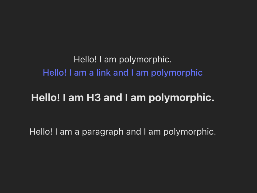
And there you have it, your very own polymorphic component!
Remember, polymorphic components are just one of many techniques available in the React ecosystem to help create modular and reusable code. Experiment with them, explore the possibilities, and continue honing your React skills to build outstanding applications.
I will be honest, the first time I heard about polymorphic component and what it does, my jaw dropped. Funny enough, I have been using polymorphic components even before I found out it is called polymorphic components. Back in 2021, I work alot with a React components library called Mantine and one of its components, Anchor, has this feature baked in.
